Do we need to consider all cycle frequencies, both positive and negative? Do we need to consider all delays and frequencies in our second-order CSP parameters?
As you progress through the various stages of learning CSP (intimidation, frustration, elucidation, puzzlement, and finally smooth operation), the symmetries of the various functions come up over and over again. Exploiting symmetries can result in lower computational costs, quicker debugging, and easier mathematical development.
What exactly do we mean by ‘symmetries of parameters?’ I’m talking primarily about the evenness or oddness of the time-domain functions in the delay  and cycle frequency
  variables and of the frequency-domain functions in the spectral frequency
  and cycle frequency variables. Or a generalized version of evenness/oddness, such as
  , where
  and
and  are closely related functions. We have to consider the non-conjugate and conjugate functions separately, and we’ll also consider both the auto and cross versions of the parameters. We’ll look at higher-order cyclic moments and cumulants in a future post.
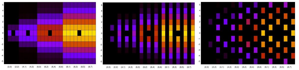
You can use this post as a resource for mathematical development because I present the symmetry equations. But also each symmetry result is illustrated using estimated parameters via the frequency smoothing method (FSM) of spectral correlation function estimation. The time-domain parameters are obtained from the inverse transforms of the FSM parameters. So you can also use this post as an extension of the second-order verification guide to ensure that your estimator works for a wide variety of input parameters.
Continue reading “Symmetries of Second-Order Probabilistic Parameters in CSP”

 .
.